Buttons are the unsung heroes of web design. They're small, they're often ignored, but they carry the weight of each conversion, sign-up and purchase on your site. A website interface's button can either get a visitor to take an action or cause them to leave your page altogether. In 2026, button design leans heavily on psychology and usability principles, not just a rectangular surface with some words on it.
This guide will cover all the fundamentals of UX, plus the latest trends that are influencing digital interfaces this year through buttons.
Why Buttons Matter More Than You Think
Each and every button on your website is a decision point. It says "click here to move forward" or "click here to complete this task." Buttons can be a point of friction, cause confusion and result in lost conversions when poorly designed. They tend to be intuitive when designed well, as the user doesn't have to second-guess themselves when deciding where to click.
Here's the thing: the right button in the right place, with the right color and the right copy, can meaningfully lift conversion rates. That's how much power this small UI component has on your bottom line.
Here are some reasons why it's important to give buttons special design consideration:
- They enable key activities such as making purchases, signing up, and downloading.
- They direct the user to the next step in a process as needed.
- They convey hierarchy (what is most important on the page)
- They establish trust by providing consistency and predictability.
- They have a direct influence on accessibility and inclusivity.
1. Visual Hierarchy
There are different types of buttons. Always have a primary call-to-action (CTA) that stands out compared to any secondary or tertiary call-to-action. This is usually done with the following:
One of the most frequent errors is presenting several primary-looking buttons on a single screen. The more you say, the less you say.
- Color contrast: primary buttons are bold and high in contrast.
- Size: primary buttons may be slightly larger.
- Position: main actions are located where the eye will naturally go
- Whitespace: room around crucial buttons captures attention
2. Affordance and Recognizability
An effective button for website design must look clickable. This is called "affordance," and it means the button is a visual indicator of its purpose. The purpose of an element should never be left for the user to guess, it should always be clear.
There are multiple ways to reinforce affordance, such as:
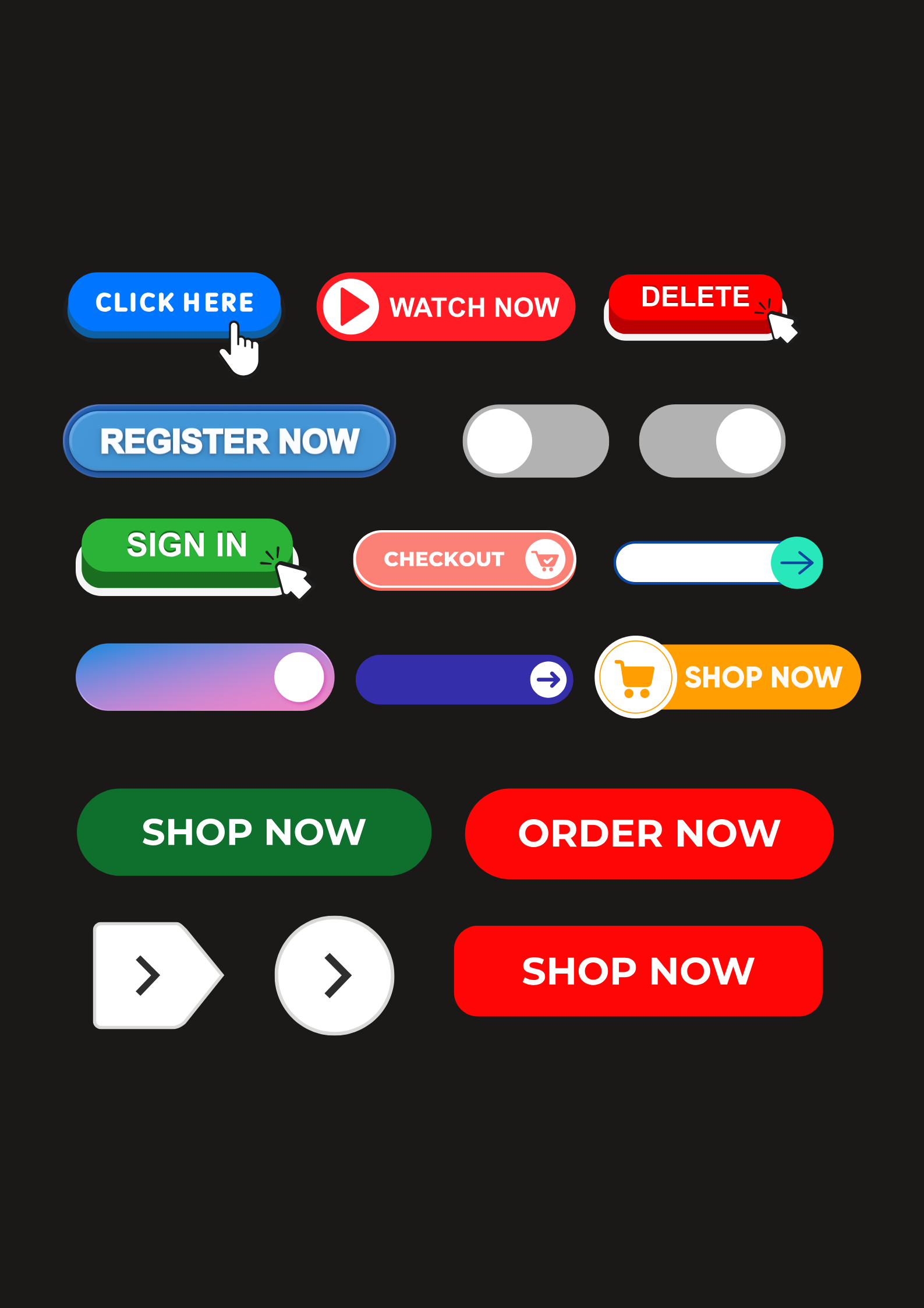
- Smooth shadows or gradients that give the button a third dimension.
- Rounded corners (which read as more "pressable" than sharp corners)
- Active and hover states that react to cursor movement.
- A uniform look throughout the site
3. Legible, Action-Oriented Copy
The copy on a button is as important as its appearance. Vague words such as 'submit' or 'click here' do not perform as well as action-oriented, specific words.
When writing button copy:
- Use powerful verbs: "Start Free Trial," "Get My Quote," "Download Now"
- Keep it short, 2-4 words is ideal.
- Match the copy to user intent and the stage of the funnel
- Avoid vague words that don't convey value
4. Accessibility First
In 2026, accessible button design is no longer optional, it's a must, and in many regions it's also expected under local digital accessibility standards. Accessible buttons must support people with visual, motor or cognitive disabilities.
Key accessibility considerations:
- Avoid low contrast (WCAG AA) between text and the background of buttons
- Make buttons large enough for touch targets (the recommended minimum size is 44 × 44 pixels)
- Add clear focus states for keyboard navigation
- Don't use styled div elements, use semantic HTML (<button> tags)
- Add descriptive aria-label attributes for screen readers
Button Styles Trending in 2026
As the year goes by, design gets updated, and buttons are no exception. Here are the prevalent button styles in web design this year.
Neumorphism 2.0
Neumorphism has come back with its soft, extruded appearance, but now enhanced by improved accessibility features. The buttons seem to be pressed into the background or in relief, with delicate shadows and highlights, rather than sharp edges.
Glassmorphism Buttons
Blur and transparency effects are still widely used in frosted-glass effects, particularly for dashboards and SaaS applications. These buttons feel light and contemporary and tend to be overlaid on colorful backgrounds.
Kinetic Micro-Interactions
2026 buttons don't just sit there, they react. Expect to see:
- Light bounces or scales on click
- Color transitions that aren't abrupt (no hard cuts)
- Loading spinners appearing right on the button after clicking
- Success checkmarks that animate in place of the original label
Gradient and Duotone Buttons
The traditional flat, single-color button is being replaced by more dynamic, colorful gradients and duotone color schemes that bring depth and personality to buttons without sacrificing usability.
Minimalist Outline Buttons
Outline (ghost) buttons are still favored for secondary actions on sites with a more editorial approach, existing without standing out on the page as prominently as filled buttons.
Rounded, Pill-Shaped Buttons
Pill-shaped, fully rounded buttons are seeing a rise in use, as they're perceived as more tappable and friendly, particularly in mobile-first applications.
Anatomy of a High-Converting Button
For website projects, here's what's important:
- Shape: rounded corners tend to feel more approachable, whereas sharp corners work better for more formal, corporate brands.
- Color: should contrast clearly with the background and fit the brand. Color meaning depends on context, so consider what a color like red signals within your specific interface, such as a warning versus a bold primary action.
- Size: big enough to be easily tapped on mobile, but not so large it disrupts layout balance
- Padding: enough internal space so it doesn't feel tight or non-clickable
- Icon pairing: icons used alongside text can help users recognize the action more quickly (e.g., a cart icon next to "Add to Cart")
- Placement: buttons should be positioned where users would expect, for example after content or forms.
Common Button Design Mistakes to Avoid
These are common pitfalls that even experienced designers can fall into. Watch out for:
- Too many calls to action on a single page, this confuses the user and reduces focus.
- Low contrast text, stylish but unreadable button labels, bad for usability and accessibility
- Disabled-looking buttons that are actually active, grayed-out buttons are sometimes overlooked despite being clickable
- Inconsistent styling across the site erodes user trust
- Unclear or overly "cute" button text, this can confuse instead of convert
- Ignoring mobile touch targets, a button too small for thumbs hurts mobile conversions
- No response on click, users want visual feedback that their click registered, that something is loading, etc.
Button Design for Different Use Cases
Different buttons serve different functions and should be designed accordingly:
- Ecommerce buttons, such as "Add to Cart" and "Buy Now," should feel urgent and confident, often in bold colors with strong verbs.
- SaaS sign-up buttons should stress low commitment and ease of sign-up, frequently paired with reassuring subtext such as "No credit card required."
- Submit and Cancel/Back buttons must be clearly distinguished, with Submit as the more prominent action.
- Navigation buttons should be clear and consistent rather than flashy, since they appear on every page.
- Newsletter/lead-gen buttons often work better with personalized, benefit-driven copy like "Send Me Tips" rather than a plain "Subscribe."
Testing and Optimizing Your Buttons
Great button design is an iterative process, not a one-time thing. Here are some things you can do to optimize:
Even simple changes, like replacing "Submit" with "Get My Free Report," can produce significant engagement boosts.
- Conduct button color, copy, size and placement tests.
- Analyze user clicks using heat maps and click-tracking tools
- Track conversion rates for specific CTAs
- Test buttons on various devices and screen sizes
- Collect qualitative feedback during user tests