In 2026, designing a website involves balancing the enduring principles of user experience with the tools and styles emerging from this year's trend of leveraging AI to streamline workflows, embrace organic designs, and prioritize performance-driven engineering. To sum up: you first establish your objectives and your audience, then your wireframe, your AI-generated design, accessibility, visual systems, and optimization for performance all come into play before testing and launching. You may be scratching your head about how to create a website in 2026 that really functions, not just for a month, but for the long term.
Web design is always a combination of art and engineering, and 2026 has taken it to the next level. AI has taken over much of the grunt work in creating layouts and copy, and designers are increasingly taking a more human, textured, and deliberate approach to their visual decisions. In this article, we'll explain how to build a website step-by-step based on the trends and techniques within the industry today.
Why Website Design Looks Different in 2026
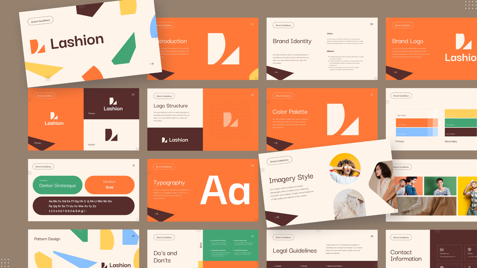
In order to understand what has changed, it is helpful to first get to know the steps. As AI templates take the lead, some designers describe a homogenization problem: too many sites that have a "vibe" coded design. As a reaction, two trends have popped up, some brands are going towards tactile and man-made looks with raw shapes and strong contrasts, and other brands keep their frontends to lightweight and sustainable code, which loads faster and performs better for both users and AI search crawlers. Meanwhile, layouts are becoming softer in a departure from the rigid layouts of the past few years, and the organic shapes and flowing lines break uniformity to create more natural and approachable digital experiences.
That context is important as it influences all of the following steps. Web design isn't just about choosing the ‘coolest’ trend; it's about the ones that address the actual needs of your brand and your visitors.
Step 1: Define Your Goals and Target Audience
All good websites begin before anything is designed. Ask yourself: What is this site really about? Who is it serving? What is one action you want a visitor to your website to perform: purchase a product, book a call, read an article, join a newsletter?
This is the top reason a website doesn't convert. The homepage is a beautiful design but has no purpose. List your main goal, your secondary goals, and a very brief description of your ideal visitor. Now you have a North Star to guide all of your design decisions.
Step 2: Research Current Design Trends (Without Copying Them)
Having a vision and goals in place, it's worth understanding which options are available and appropriate for your brand. Looking forward to 2026, there are a few trends to take note of:
When it comes to website design for 2026, the main thing to keep in mind is SELECTIVITY. All trends are not suitable for all brands. A financial services website isn't likely to be a big success with a Y2K neon gradient, but a beauty or lifestyle brand could benefit from it.
- Anti-grid layouts are becoming commonplace instead of rigid, uniform grids, formed by flowing lines, soft gradients, and irregular, organic shapes that seem less mechanical.
- Bento box modular layouts are structuring content into distinct chunks, or "boxes" (like a bento box), making it easier for visitors to scan and digest a page.
- Viewport-scaled typography makes single words into statements, with bold, expressive typography taking center stage.
- Bright, vibrant and saturated colors, popular in the Y2K era, are taking the place of muted minimalism, particularly in the lifestyle and youth products.
- WebGL, 3D and interactive elements are providing users with immersive previews, such as spinning a product 360 degrees or viewing a virtual space.
Step 3: Plan Your Information Architecture
Before picking up a wireframe tool, sketch an outline of your website's structure according to your goals and style. This is your information architecture, a blueprint of all your pages, how they are linked and how a visitor moves from one page to another.
Keep it simple at first, with the homepage, major pages (About, Services, Products, Contact), and anything else that supports the main pages (blog posts, FAQs, etc.). Next draw the user flow, the journey the visitor makes from arriving on your site to performing the action you want. A confusing navigation system and dead pages that don't take visitors anywhere are prevented by good information architecture.
Step 4: Wireframe Your Layout
Wireframing is an element of page design and structure. Ignore color, fonts, and imagery at this stage, only think about hierarchy and layout. What is the proper place for the headline? What is the call to action button? What area is required for each section?
Any tools such as Figma, Sketch, or even pen and paper are fine here. Low-fidelity wireframes allow you and any stakeholders to establish the structure without wasting time on cosmetic cleanup. Moving a box on a wireframe is much less expensive than redesigning a fully styled page at a later date.
If you are using a bento-grid structure (one of the more prominent structures of the year) this is where you want to draw in those walls and determine what content will reside in each of these blocks.
Step 5: Choose an AI-Assisted Design Tool
This is where 2026 workflows differ significantly from even a few years ago. With the help of AI tools such as Figma's AI features, Framer AI, and others, you can create layout drafts, generate copy suggestions, and even create images based on a simple prompt.
These tools are, honestly, incredibly useful when they're used properly, in that they can save hours of repetitive work, like generating several layout variations, drafting placeholder copy, or putting together quick mockups to show stakeholders. Use the AI-generated content as a starting point, not the final thing. When a human designer brings intention, brand personality, and a polishing touch to that AI-generated starting place, that's usually where the sites stand out in 2026. Left unedited, pages that are purely AI-generated tend to sound and feel the same, and that's the whole issue designers are trying to solve to break the sameness.
Step 6: Build Your Visual Design System
After getting your structure locked down, the next step is to develop your visual language: typography, color palette, spacing and repeatable elements such as buttons, cards and navigation bars. Here are some tips to consider for 2026:
It's also the time when you'll determine the amount of texture, grain, or organic forms in your visual identity. Less is more, gradient overlays and decorative shapes can be distracting and slow down loading times.
- Typography as a design element and not only as text. Try a combination of one or two bold, large fonts for headlines and a simple, easy-to-read font for the body text.
- Intentional color choices. Whether you want to go bold and saturated or soft and muted is up to your brand and audience, not just what's in fashion.
- Evenly spaced, repeatable parts. A design system featuring reusable buttons, cards and form elements keeps your site consistent and helps you make updates quickly in the future.
Step 7: Design for Accessibility From the Start
Responsible website design in 2026 isn't just about creating a visually appealing and user-friendly site; it's also about ensuring it's accessible. Accessibility is a growing concern for search engines, and a meaningful share of internet users navigate the web with some form of disability.
It's far easier to build accessibility in from the planning and wireframing stage than to retrofit it after launch, but it should stay a priority through design, development, and testing too. Getting it right also improves the experience for every visitor: better contrast, cleaner navigation, and so on.
- Ensuring text has enough color contrast with backgrounds
- Using readable font sizes, a minimum of 16px for body text is fine
- Ensuring all interactive elements are keyboard accessible
- Providing appropriate alternative text for images and ARIA labels where needed
- Testing your webpage design with a screen reader
Step 8: Add Interactions and Micro-Animations
After you've got your static design sorted out, add interactivity. Micro-animations such as hover effects, button transitions and reveals as users scroll down bring life to a page without overloading it.
This has been extended by the typography trends of 2026, which feature kinetic typography, font weight and width changes as the reader scrolls down the page, creating a tactile effect through the dynamic nature of the experience. WebGL is a new technology that can let viewers rotate a product or "walk through" a space, useful for brands interested in the "3D and immersive" trend.
The guideline is that every animation should make a point: highlight a call to action, show a state change, or point the way; it should tell the viewer something, not just be for the sake of pretty pictures. Too much motion will negatively impact usability and loading times.
Step 9: Optimize for Speed and Performance
Even the most visually striking websites are unsuccessful if they are slow to load. In 2026, speed is no longer just a concern, it's a priority. Search engines and AI crawlers increasingly prioritize fast, lightweight websites, and user patience is becoming a scarce resource.
One of the more functional, less flashy trends in 2026 is the "digital sustainability" attitude, getting rid of the bloat and using lean, efficient code.
- Resize and compress all images to an appropriate size.
- Reduce the number of plugins (particularly if using WordPress or a similar CMS)
- Minimize unnecessary JavaScript: many designers are moving towards using less JavaScript and more CSS.
- Leverage lazy loading on images and videos below the fold.
- Use Google PageSpeed Insights or GTmetrix to regularly check load speed.
Step 10: Test, Launch, and Monitor
Test your site on devices and browsers before you launch. Test it on mobile, tablet and desktop, and look for any sticking points: confusing navigation, broken forms, slow loading pages or accessibility issues you may have overlooked.
After launch, don't view it as the end. Pay attention to analytics, bounce rate, time on page, and conversion rates, as these will tell you what's working and what's not just in a mockup. Repeat using that data. The top sites of 2026 aren't just set in stone; they're continually developed by gathering real user data.