Skeleton screens reduce perceived load times and keep users engaged while real content is still on its way. Blank screens of white or grey can be more frustrating for users because they're expected to wait for content to load, and they have nowhere to see the structure of the content that will load. Used alongside an animation such as a shimmer or pulse effect, this design pattern is not only easier to comprehend but also helps maintain the user's focus and fosters a sense of a more responsive and rapid interface, even if the actual loading time remains unchanged. By 2027, AI is expected to automate or augment many UX tasks, pushing teams toward AI-generated interfaces and adaptive loading states such as predictive skeleton screens.
Skeleton screens are something you've likely already seen on platforms like YouTube, LinkedIn, or Netflix, where gray rectangular boxes appear before the content loads in. It's one of the most effective tools a UX designer has for softening one of the most frustrating parts of the digital experience: waiting.
Key Takeaways
- Skeleton screens simulate a page's layout instead of showing blank screens or spinners.
- A subtle shimmer or pulse animation signals loading without being distracting.
- Skeleton screens improve perceived speed, not actual load time.
- They work best on content-heavy, e-commerce, dashboard, and mobile platforms.
- Match the final layout, prioritize key elements, and keep animations subtle.
- Avoid overcomplicated designs, mismatched shapes, and unnecessary skeletons for instant loads.
- Measure success with bounce rate, engagement, conversions, and metrics like FCP/TTI.
What Are Skeleton Screens?
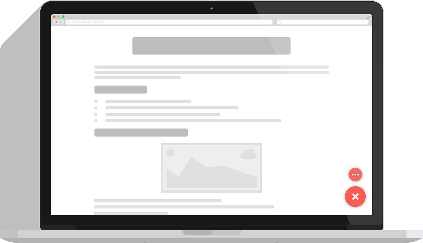
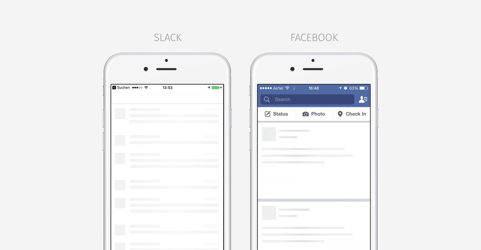
Skeleton screens are placeholder pages that emulate how a page should appear while it is loading actual content. Users see an outline made of gray boxes, lines and shapes, arranged in the same order and structure as the final content.
Skeleton screens change the psychology of waiting by giving users a glimpse of what's next. Instead of wondering whether something is going wrong, users can see that the system is working and that content is on its way.
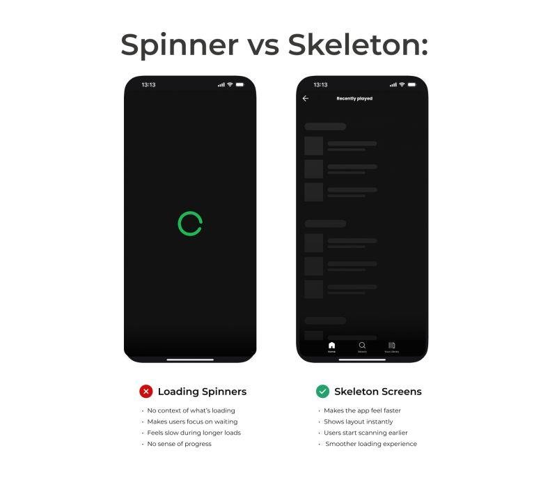
This is not a loading spinner or a progress bar, which provide no information about what's actually loading. A skeleton screen, by contrast, suggests the nature, dimensions, and location of upcoming content such as headlines, images, paragraphs and cards, making the transition from "loading" to "loaded" feel natural and comfortable rather than abrupt and jarring.
How a Skeleton Loading Animation Works
This is usually a loading state that shows up when a user clicks on a link or logs into an app, and is gone within a few seconds. Typical features of the animation are:
- Placeholder content: rectangles, circles and lines that show where content (images, text and buttons) will be placed.
- A shimmer or pulse effect: a soft moving highlight that sweeps across the placeholders every 1.5 to 2 seconds, indicating the page is working.
- A cross-fade transition: as real content appears, the skeleton fades out while the real content fades in, so there's no sudden visual change.
It is not a decorative animation. The subtle motion reassures users that the system hasn't frozen or failed, in contrast to a static gray box with no movement at all. When a skeleton loading animation moves gently and rhythmically, it conveys a simple psychological message: "Be patient, it's nearly ready."
These are usually built in front-end frameworks such as React or Vue, which let developers create skeleton components that adapt to different types of content, from a simple blog post to a complex, data-heavy dashboard.
Why Skeleton Screens Improve Perceived Performance
It's the word "perceived" that matters here. A skeleton screen doesn't make your server respond faster or your API calls complete any sooner, it simply changes what users see while they wait. All it does is alter the user's perception of the wait time. Here's how:
1. They Reduce Cognitive Load
The brain expends more energy trying to predict its surroundings when there's no clear idea of what's happening. When the screen shows a skeleton, there's no uncertainty about what the page will look like, so there's less mental effort spent guessing.
2. They Prevent Layout Shift
The last thing you want while loading is content suddenly popping in and shifting everything else on the page, which frustrates users and can hurt a site's Core Web Vitals scores. Because skeleton screens are designed to match the final content and its position, the layout stays stable as real content loads in.
3. They Keep Users Engaged, Not Idle
Research on waiting psychology has consistently shown that idle time feels longer than engaged time. A blank screen leaves users with nothing to focus on, whereas a skeleton screen gives them something to visually track, which reduces the feeling of time passing.
4. They Set Accurate Expectations
Skeleton screens preview the content and images that will appear on the page, as well as where buttons will be located. That visual preview builds trust and reduces the frustration of not knowing whether a page is broken or simply still loading.
5. They Are Better Than Spinners and Progress Bars
A skeleton screen provides a preview, unlike a generic spinner, which gives no information at all about page structure. Research on user perception has shown that perceived load time is significantly shorter when a skeleton screen is shown instead of a traditional spinner, simply because users have something concrete to focus on.
Where Skeleton Screens Work Best
Not all interfaces need skeleton screens, but there are certain scenarios where they're genuinely helpful:
- Content-rich sites (blogs, social feeds, news sites) with lots of text and images
- Product grids and listing pages on ecommerce sites that load images and prices asynchronously
- Dashboards with widgets or charts that load separately from one another
- Mobile apps dealing with inconsistent network speeds and frequent load times
- Video and streaming platforms, especially those that serve thumbnails and metadata separately from the video player
If a page loads nearly instantly, a skeleton screen may not be necessary, a flash of skeleton lasting only a few hundred milliseconds can end up being more of a distraction than a help. Skeleton screens earn their place when load times are actually noticeable, typically anywhere from a few hundred milliseconds to a few seconds.
Generative AI is expected to be embedded into nearly every company's digital footprint by 2027, driving wider adoption of AI-generated UI components, including adaptive loading experiences like skeleton screens.
Best Practices for Implementing Skeleton Screens
For the best results with skeleton screens and a good skeleton loading animation, keep these tips in mind:
Match the Final Layout Closely
Placeholder shapes should match the size, spacing and position of the actual content. A skeleton that doesn't resemble your site's real layout makes the transition feel jarring rather than fluid, which defeats the entire purpose of using one.
Prioritize Key Elements First
Decide what content should load and appear first on a page, navigation, headlines, key images, and save footers or related links for later. This keeps users oriented and gives them something worthwhile to focus on right away.
Keep Animations Slow and Subtle
A shimmer or pulse that's too fast or too aggressive becomes distracting instead of reassuring. A slower, smoother cycle, around 1.5 to 2 seconds, feels calmer and less intrusive.
Show Skeletons Quickly
A skeleton screen should appear within 300 milliseconds of a user's action. Users can end up feeling like they waited for nothing if the skeleton only shows up after a long delay.
Use a Smooth Cross-Fade
Make sure there are no sudden pops or hard cuts between the skeleton and the real content. A cross-fade, where the skeleton fades out as the content fades in, feels far more professional and polished.
Design for Accessibility
Not every user experiences a skeleton screen the same way. Announce content as it loads, respect users' reduced-motion preferences by offering a static, non-animated version of the skeleton where appropriate, and use ARIA attributes to support screen readers.
Adapt for Different Devices
Mobile interfaces often benefit from simpler, more streamlined skeletons that save on processing power and battery life, while desktop and web applications can afford more elaborate placeholders.
Common Mistakes to Avoid
A poorly built skeleton can have the opposite effect of a well-built one. Watch out for:
- Overcomplicating the design: an overly detailed skeleton can make rendering take longer and undercut the whole point of feeling fast.
- Mismatched shapes: placeholders that don't resemble the real content confuse users instead of reassuring them.
- No animation at all: a static skeleton with no subtle movement can end up looking "broken" or "frozen."
- Ignoring load-time limits: showing a skeleton for content that loads in under a second just adds visual noise.
Measuring Whether Skeleton Screens Are Working
Skeleton screens aren't just about speed, a combination of behavioral and technical metrics is needed to measure whether one is actually working:
- Bounce rate: are fewer users leaving during the loading phase?
- Time on page and scroll engagement: are users sticking around?
- Conversion rates and task completion: has checkout or sign-up improved?
- User satisfaction feedback: do users say the app or site feels quicker?
- Core Web Vitals such as First Contentful Paint (FCP) and Time to Interactive (TTI): to confirm the skeleton isn't accidentally slowing things down.
Remember that skeleton screens increase perceived speed but don't create any real technical gain on their own. Use them to complement genuine performance improvements, not replace them, skeleton graphics on a poorly optimized backend will only help so much.
Skeleton Screens vs. Traditional Loading Indicators
Most of the time, all loading states get lumped together, but skeleton screens aren't the same as spinners or progress bars.
- Spinners indicate that something is happening, but provide no information about the actual thing.
- Progress bars indicate remaining load time, but only work well when that load time is predictable.
- Skeleton screens give users an idea of what's coming, closer to a sketch of the final page.
That's why so many major platforms have shifted to a skeleton interface for content-heavy sites. They don't fill the wait with motion for motion's sake, they actively prepare users for what they're about to see.